The final installment of our three part series on Rob Sarcchetto features a retrospective of his rotted favorites from over the years. Rob was kind enough to take us through his top 10, well 11, favorite illustrations and portraits.
If you’re interested in having Rob Sarcchetto zombify you or your loved ones you can always visit his site ZombiePortraits.com for information and rates. Your fix for fetid flesh can also be had by visiting Sarcchetto’s indiegogo page, where you can find out how your ideas can appear on Rob’s site The Daily Dead.
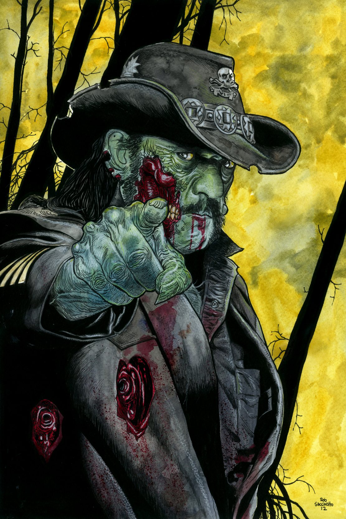
1. This Zombie Portrait of Lemmy Kilmister from Motorhead, was a commissioned piece from a fan. It was I think, an 11X17 size so it really allowed me to add a lot of great hatching and detail with highlights. I really love the way it turned out, and I wish I could credit the original photographer who shot this photo that I referenced, but his name escapes me at the moment. A lot of the art I’m able to create in the Zombie Portrait end of things, comes from good photo reference.
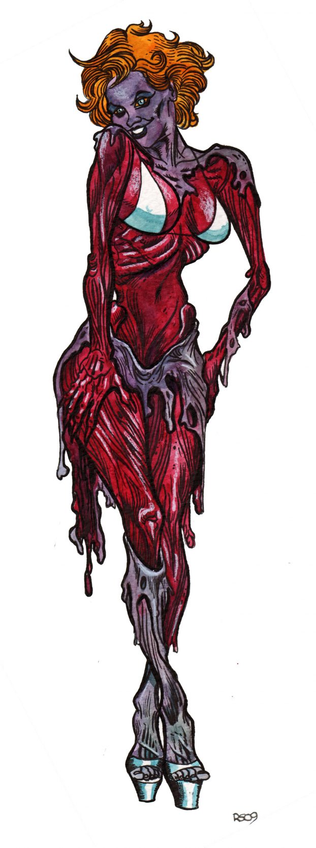
2. This was just a Zombie Babe Pinup entry into my Zombie Daily blog that I spent a little more time on. I think that I referenced the face from perhaps a magazine, and went from there. like this one just because it ended up being something more than just a stand alone pinup. I actually really like the surroundings and how they turned out despite being totally spontaneous and add-libbed…sometimes it works!
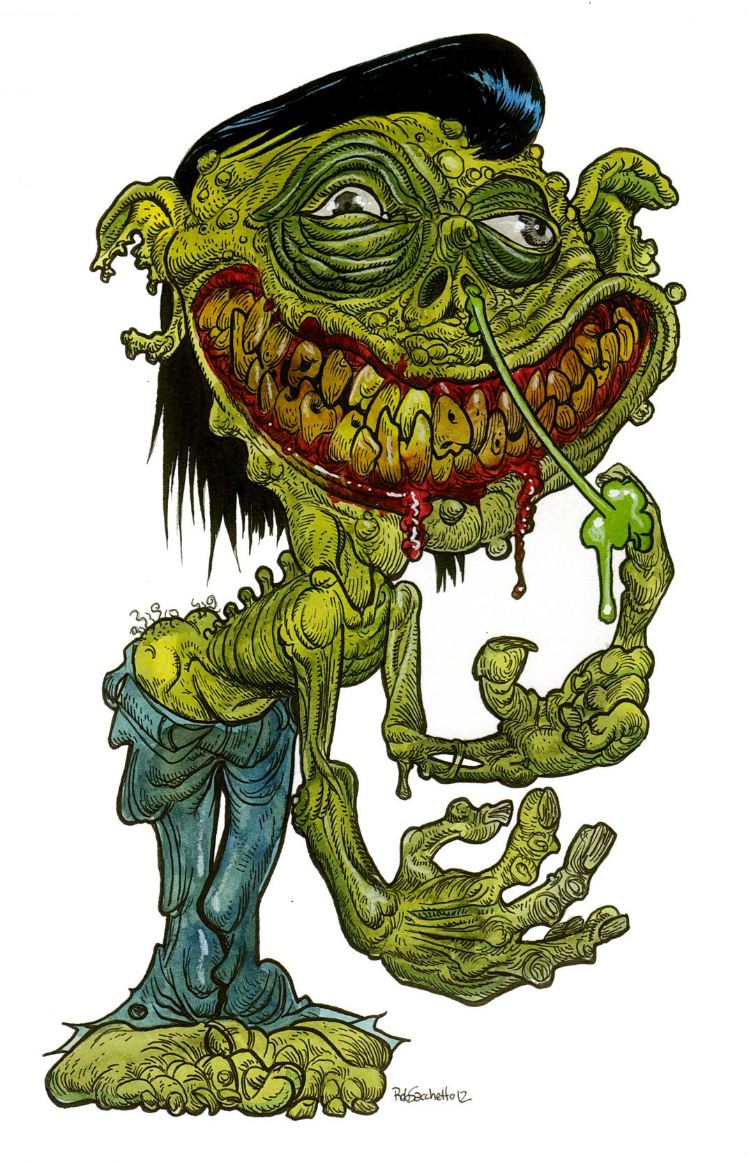
3. Ha! Okay, this image was from a series of two really ‘out there’ illustrations that I’ve always wanted to do more of that were kind of based loosely on the old Basil Wolverton Mad Magazine drawings. I often try to shake things up with styles when I find myself drawing too much of the same thing, and this was one of the results. Again, I did this in a completely spontaneous way, not really planning on how it would eventually look, but just letting my hand guide the drawing.
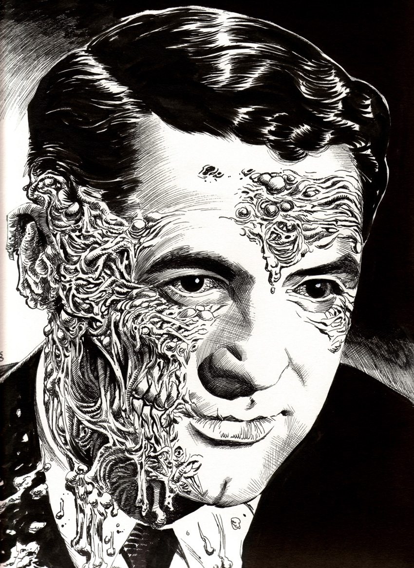
4. So, this illustration was used in my second book, “Zombiewood : The Celebrity Dead Exposed,” I really like how this image turned out. It just works and reads well, and i really like the way the brush inking on the hair ended up. I love going the extra mile with my Black and White art sometimes, as the results are usually rewarding.
5. This is an example of a straight up Zombie Portrait that I felt really turned out great. I love how the smoke effects turned out. The person who received it was so incredibly happy with it, it just adds to my joy in doing these portraits for people.
6. An older pinup for Zombie Daily. I just liked the color choices and simplicity of this piece. It was taken from an original, very small photo in a very old French Photo magazine that I kept around for years thinking that one day I’d like to use it for a drawing..I finally did!
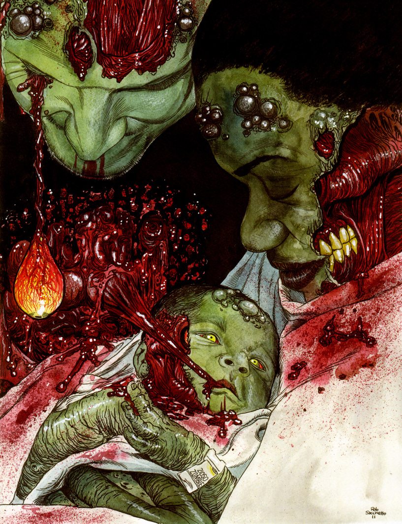
7. One of my favorite Zombie Portraits, in terms of the original photo given to me to Zombify, execution, symbolism, and outcome. It was this couples second portrait, the first being their wedding. Again, sometimes they just come out very nice, despite being the living dead. I love doing Family Zombie Portraits!
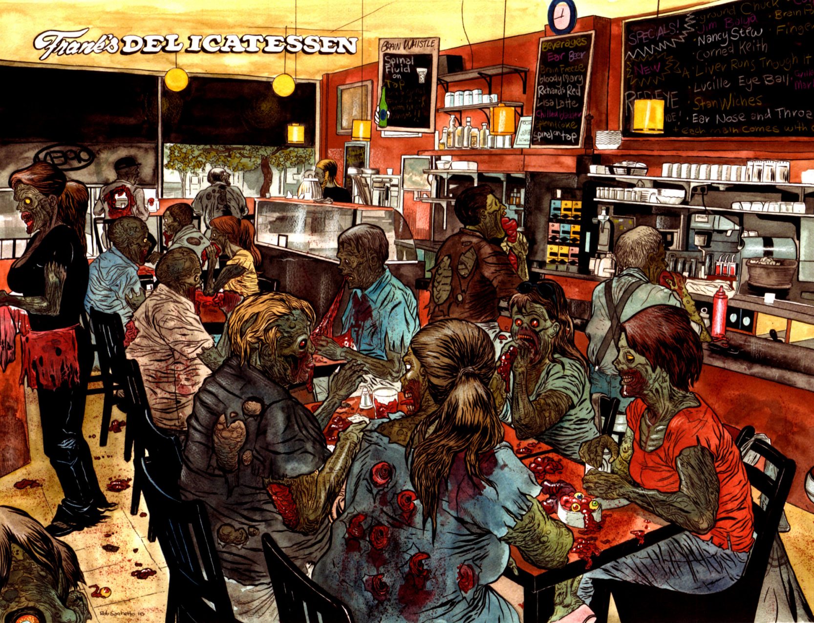
8. This was a HUGE commissioned piece that I did for a friend and local restauranteur. I went in and shot the photo during the lunch rush, and then carefully recreated this as a massive 20X30 inch portrait incorporating Zombie themed menu selections as well. I’m very proud of the way that this turned out, and it’s displayed in the restaurant for a month in and around every Halloween.
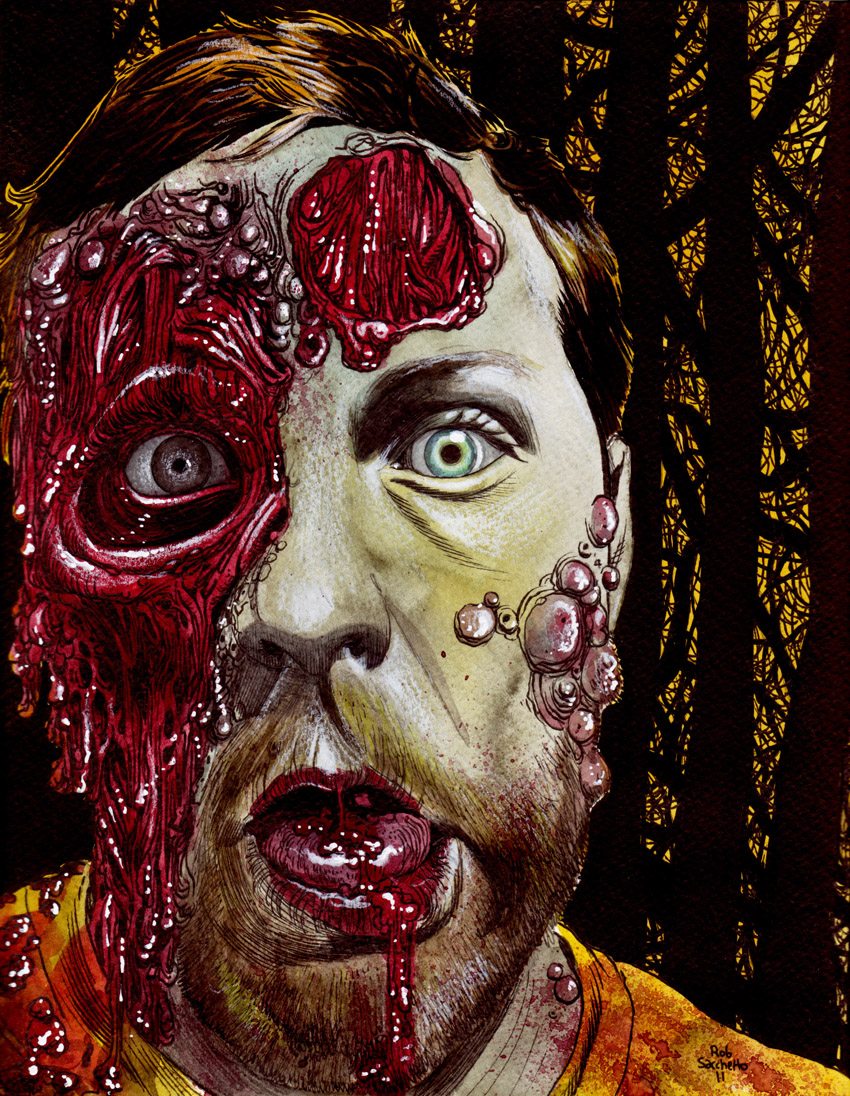
9. Often times the photo given to me to Zombify really dictates how well the portrait turns out. This is just another example of a portrait that I thought really ended up well, lighting wise and is totally effective as a Zombie Portrait.
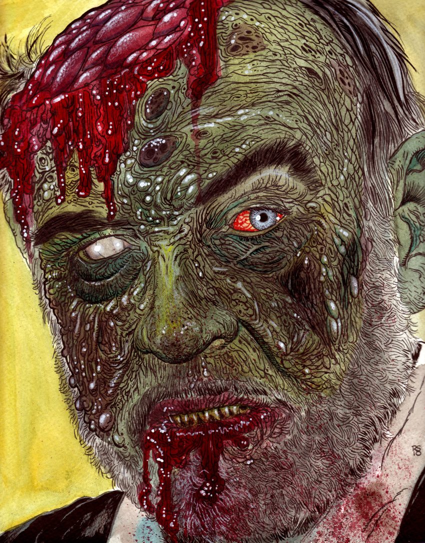
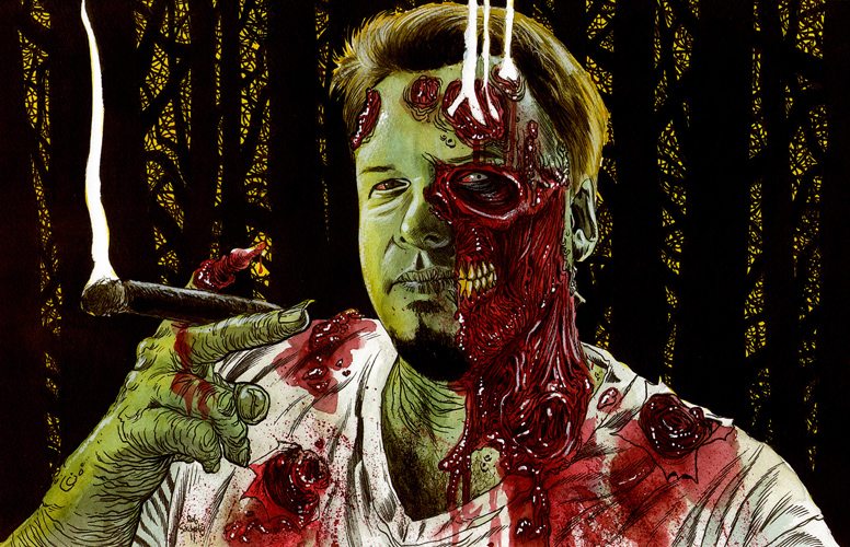
10. The Sean Connery Zombie Portrait. This too was created for my Zombiewood book, and is one that I liked the outcome of because of it’s truly gory details. I like how the skin and beard textures ultimately turned out.
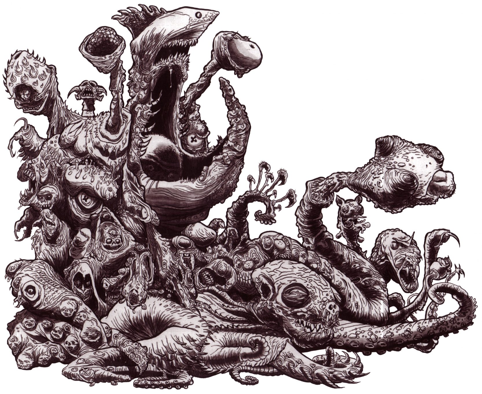
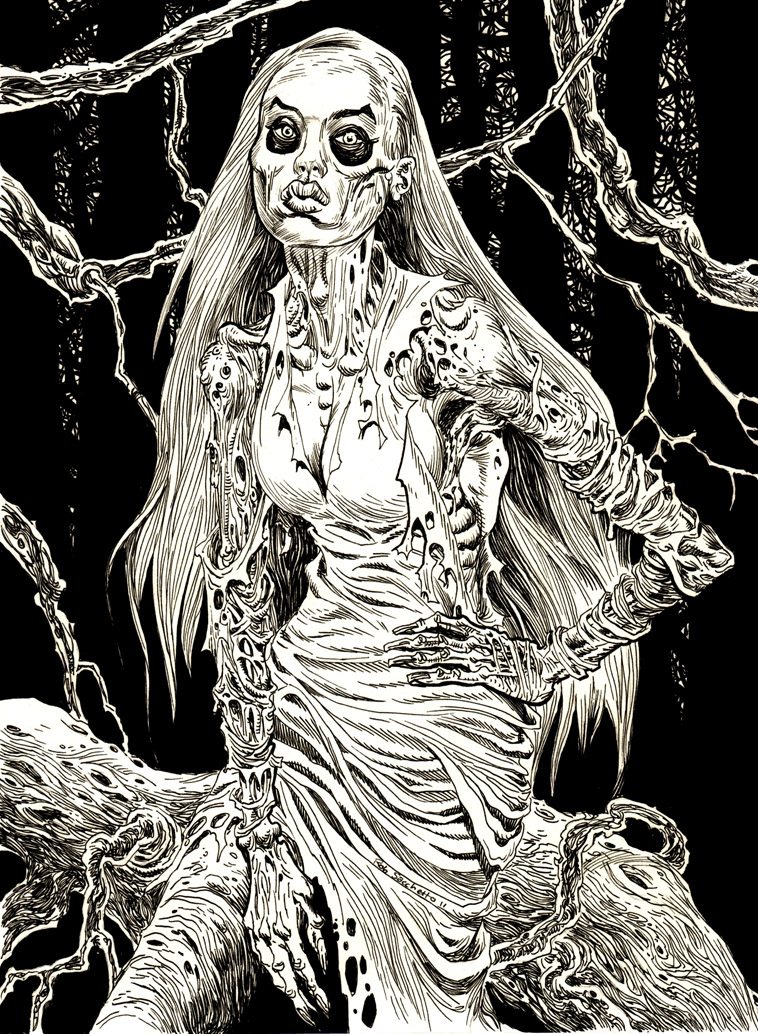
Bonus Illustration: Dead Flesh Monster